Loading Skeleton
It's inevitable some users of your application will have slow connections. A well thought out design accounts for varying internet speeds and displays a loading state to the user. However, making the user stare at a spinning wheel for an extended period of time can drastically increase bounce rates. What if there was a better way?
Skeleton Screens
Skeleton screens build anticipation for the content that is going to appear whereas loading spinners (and progress bars) put the focus on the wait time that the user has to endure. Apple has agreed with this idea enough to incorporate skeleton screens into their iOS Human Interface Guidelines. They recommend displaying an outline of the initial application without text or any elements that will change. This can improve the feel of any action taking longer than a few hundred milliseconds.
Examples
By now, you've probably seen some examples of skeleton screens in your daily browsing without even noticing. For example - Facebook shows users gray circles and lines to represent the contents of a post in their timeline.

It's not just Facebook either. LinkedIn has also re-designed their layout to use placeholders.

You can trick your users into thinking your website loads faster using skeleton screens.
Building a Loading Skeleton
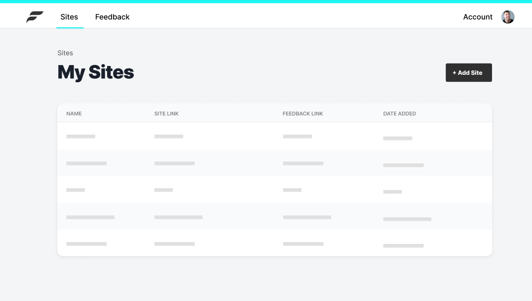
Thankfully, Chakra UI makes this easy for us. They provide a Skeleton component, allowing us to easily simulate the look of our populated table of sites.
components/SiteTableSkeleton.js
import React from 'react'import { Box, Skeleton } from '@chakra-ui/core'import { Table, Tr, Th, Td } from './Table'
const SkeletonRow = ({ width }) => (  <Box as="tr">    <Td>      <Skeleton height="10px" w={width} my={4} />    </Td>    <Td>      <Skeleton height="10px" w={width} my={4} />    </Td>    <Td>      <Skeleton height="10px" w={width} my={4} />    </Td>    <Td>      <Skeleton height="10px" w={width} my={4} />    </Td>  </Box>)
const SiteTableSkeleton = () => {  return (    <Table>      <thead>        <Tr>          <Th>Name</Th>          <Th>Site Link</Th>          <Th>Feedback Link</Th>          <Th>Date Added</Th>          <Th>{''}</Th>        </Tr>      </thead>      <tbody>        <SkeletonRow width="75px" />        <SkeletonRow width="125px" />        <SkeletonRow width="50px" />        <SkeletonRow width="100px" />        <SkeletonRow width="75px" />      </tbody>    </Table>  )}
export default SiteTableSkeleton
You'll notice I've also created a Table file exporting some composable pieces we'll use to build both the skeleton table and the real table.
components/Table.js
import React from 'react'import { Box, Text } from '@chakra-ui/core'
export const Th = (props) => (  <Text    as="th"    textTransform="uppercase"    fontSize="xs"    color="gray.500"    fontWeight="medium"    px={4}    {...props}  />)
export const Td = (props) => (  <Box    as="td"    color="gray.900"    p={4}    borderBottom="1px solid"    borderBottomColor="gray.100"    {...props}  />)
export const Tr = (props) => (  <Box    as="tr"    backgroundColor="gray.50"    borderTopLeftRadius={8}    borderTopRightRadius={8}    borderBottom="1px solid"    borderBottomColor="gray.200"    height="40px"    {...props}  />)
export const Table = (props) => {  return (    <Box      as="table"      textAlign="left"      backgroundColor="white"      ml={0}      mr={0}      borderRadius={8}      boxShadow="0px 4px 10px rgba(0, 0, 0, 0.05)"      {...props}    />  )}
Result